Let me show you what I mean.
Don't do this:

Instead, do this:
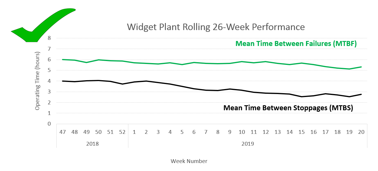
I've done all I can to make the legend in the first example work well: I've ordered the series so that they sit in the same order on the chart as they do in the legend, and I moved the legend up into some blank space in the chart area. Still, you still need to look from the lines to the legend to make sense of the chart. Can you see how in the second example, the descriptions are right next to to each line, in the same colour as the line?
How to do it? This is really simple:
- Select and delete the legend.
- With the chart selected, go to the INSERT menu, and
- Select Text Box.
- Place the text box inside your chart.
- Enter the description for the line you're annotating.
- Format the text: select a font and size, and select the font colour. I recommend bold type for this.
- Optional: format the fill of the text box to solid white (or your chart's background colour) to prevent the gridlines from coming too close to the text. Be careful to trim your text box neatly if you do this.
- Select your text box, press Ctrl, then click and drag to create a copy of the text box. Use this as the starting point (same font, size, etc) for the next line annotation.
Edit (5/6/2019) - Updated the label for the MTBS line on the second chart, as the previous version had this line also labelled as MTBF. Thanks to Joey for pointing this out.
No comments:
Post a Comment