Let's say we want to create a chart showing the results of the primary vote for the candidates in the seat of Flynn in the recent Australian federal election, and you wanted to colour each bar depending on the colours associated with those parties:
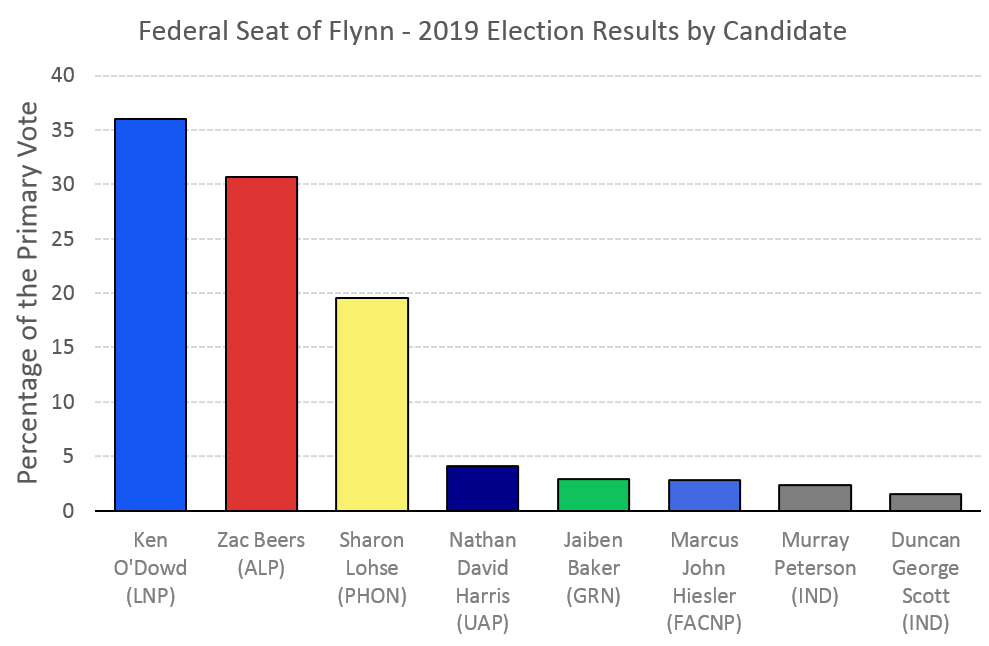
This chart is not a standard column chart, but rather a stacked column chart, with a series for each of the colours you see: six for each named party, and one grey-coloured series for the two independents.
Look how I've sorted the data below:

Let me break it down:
- In column A, I have a list of the candidates.
- In row 1, from column B to column H, I've created names for the series that will represent the different colours. I've used the party name abbreviations, but I could have listed the colour names too, for example.
- Then, in each row, for each candidate, I placed the result figure into the column that represents the party or colour that I want for that candidate.
Next, to create the chart:
- Select the entire data table
- Go to the Insert menu
- Select the column chart drop-down,
- In the 2-D Column section, select the stacked column chart (middle option)
- Now set the colour you want for each data series:
- Double-click the series (the Format Data Series box should appear on the right)
- Select the Fill and Line Icon (left-most option)
- Use the FILL section and the BORDER section to format that series.
This method seems like hard work. Why is it so much better? Formatting individual bars in a chart can actually take longer than this method when you have multiple bars. More than that: the changes can easily reset when you make a change - deliberately or accidentally - to the data series.
When you want multiple colours together in a column chart: think stacked columns.


No comments:
Post a Comment